Peppermint (talk | contribs) No edit summary |
Peppermint (talk | contribs) No edit summary |
||
| Line 20: | Line 20: | ||
{{Note|Testing!|inline=Does this work?}}{{Tip|Testing!}}{{Mature}}{{Spoilers|show_message=Test!|hide_message=Hide!|Spoiler=Testing!}} | {{Note|Testing!|inline=Does this work?}}{{Tip|Testing!}}{{Mature}}{{Spoilers|show_message=Test!|hide_message=Hide!|Spoiler=Testing!}} | ||
{{#spoiler:show=Spoilers--View at your own risk!|hide=No peeking!|Wink Wonk!}}{{Collapse top|Collapsible element|expand=Test?}} | {{#spoiler:show=Spoilers--View at your own risk!|hide=No peeking!|Wink Wonk!}}{{Collapse top|Collapsible element|expand=Test?}} | ||
{{Collapse bottom}} | https://www.mediawiki.org/wiki/Template:Collapse_top{{Collapse bottom}} | ||
Revision as of 03:54, 11 June 2021

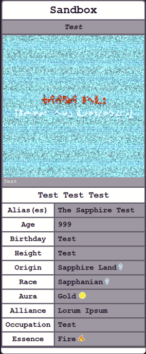
Character Infobox
How the infobox functions:
- Grabs the title of the page (presumably the character's name) and adds it to the "title" of the infobox.
- The author adds fields on the template i.e. name, alias(es) etc.
- If no picture is entered for the character, a default "no image found" image is displayed instead as a placeholder.
- In Origin, Race, Aura, and Essence, an icon appears depending on the value the author enters. For example, in "Essence," if the author enters fire, a fire icon would appear. If water, a water icon would appear, etc.
Ideas I'm working on...
- Sometimes, I'll mention the hex code of the Aura colors or markings etc. It'd be cool if I could implement some kind of functionality where if you set them as links and hover over them, it'd display a tooltip with an image of the color inside.
Testing Templates...
Testing!
Testing!
This section contains content that may be inappropriate for readers under the age of 18. Please proceed with caution!
| Collapsible element |
|---|
| https://www.mediawiki.org/wiki/Template:Collapse_top%7C} |
